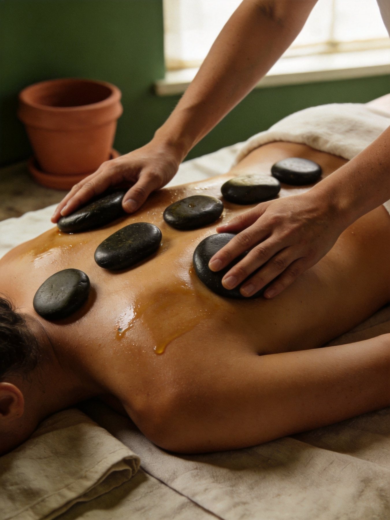
Warm Stone Ritual
90 min$185
Warm limestone surfaces instead of pure white, olive ink for text and primary actions, clay as a sparing accent. Chips show the best WCAG contrast against ink or stone-50.
Cormorant Garamond brings an editorial, couture voice to headings (used ≥ 20px only). Manrope keeps UI text calm and highly legible. Italic serif is the brand’s signature accent.
4-pt grid. Screen gutters 24, card padding 16–20, section rhythm 24–32 in app and 120 on web. Every tap target ≥ 44 × 44.
Pill buttons 52px (44px minimum). One primary action per screen in Olive 900; clay is reserved for membership and promotions.
Lucide, 1.6 px stroke, 20 / 22 / 24 px. Rounded caps echo the soft serif. Icons always pair with a label or an accessible name.
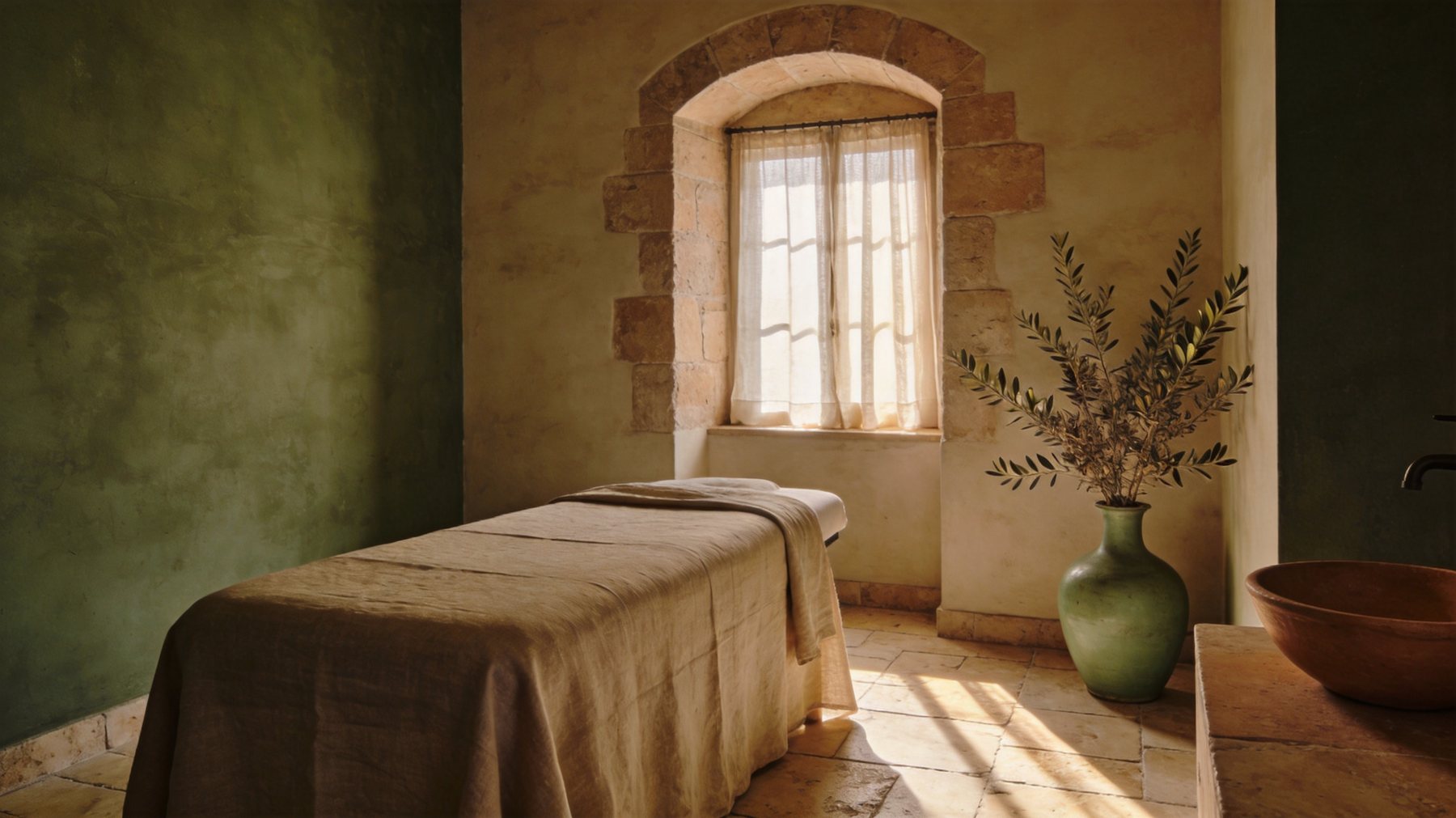
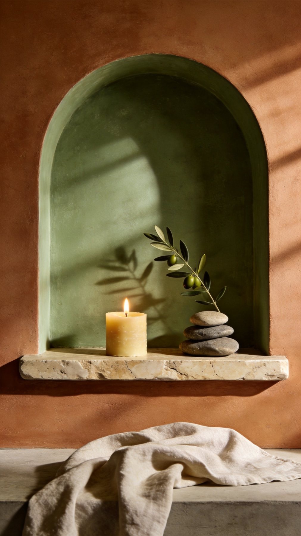
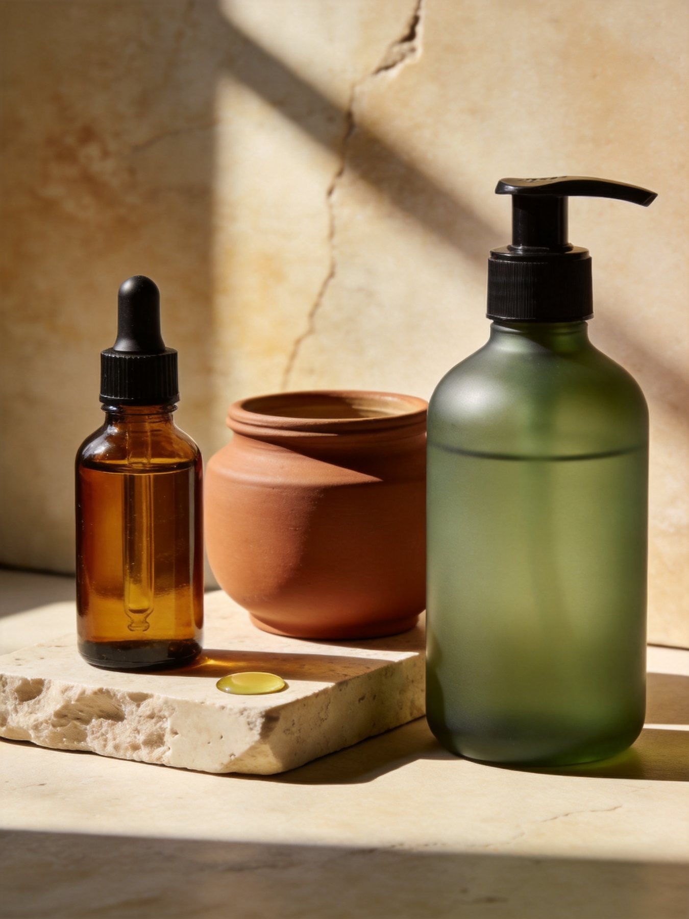
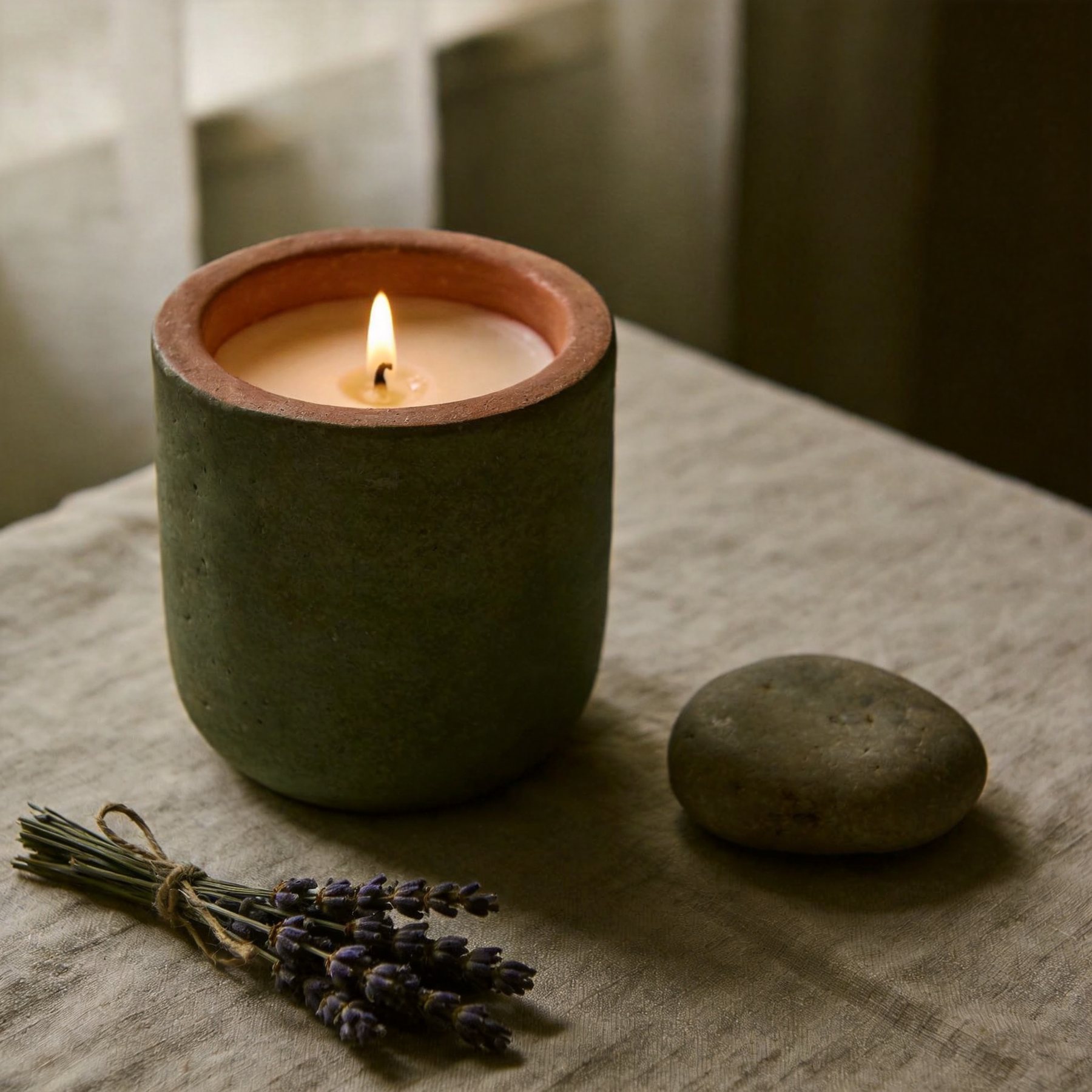
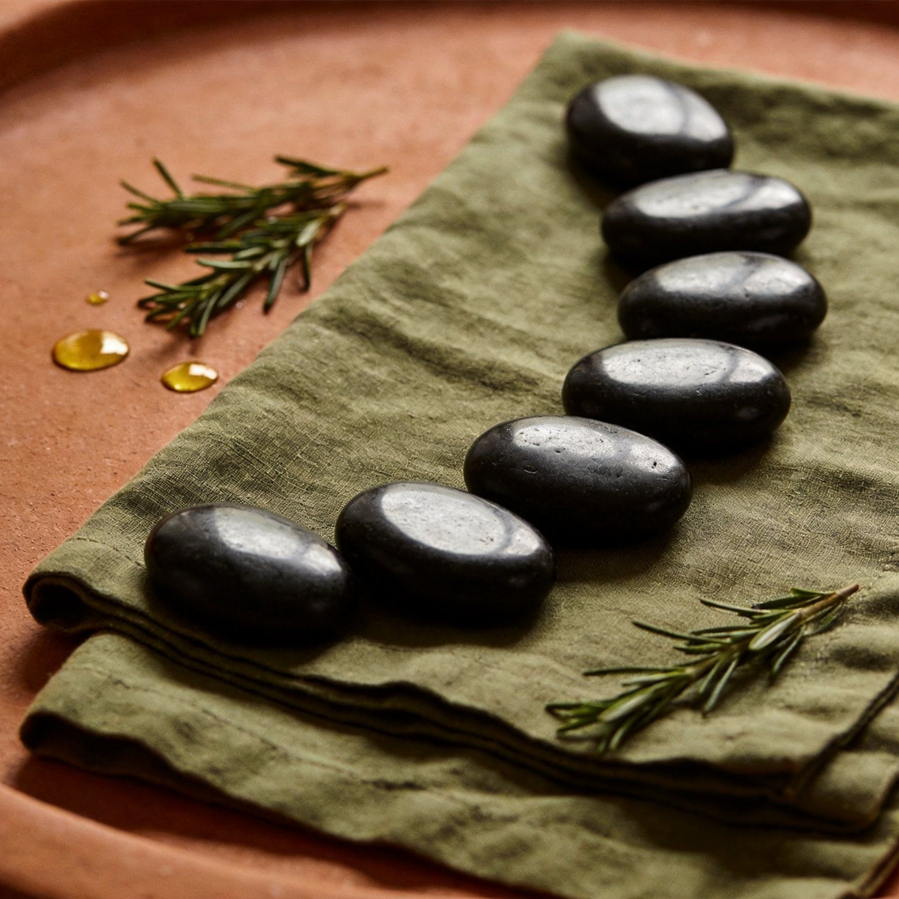
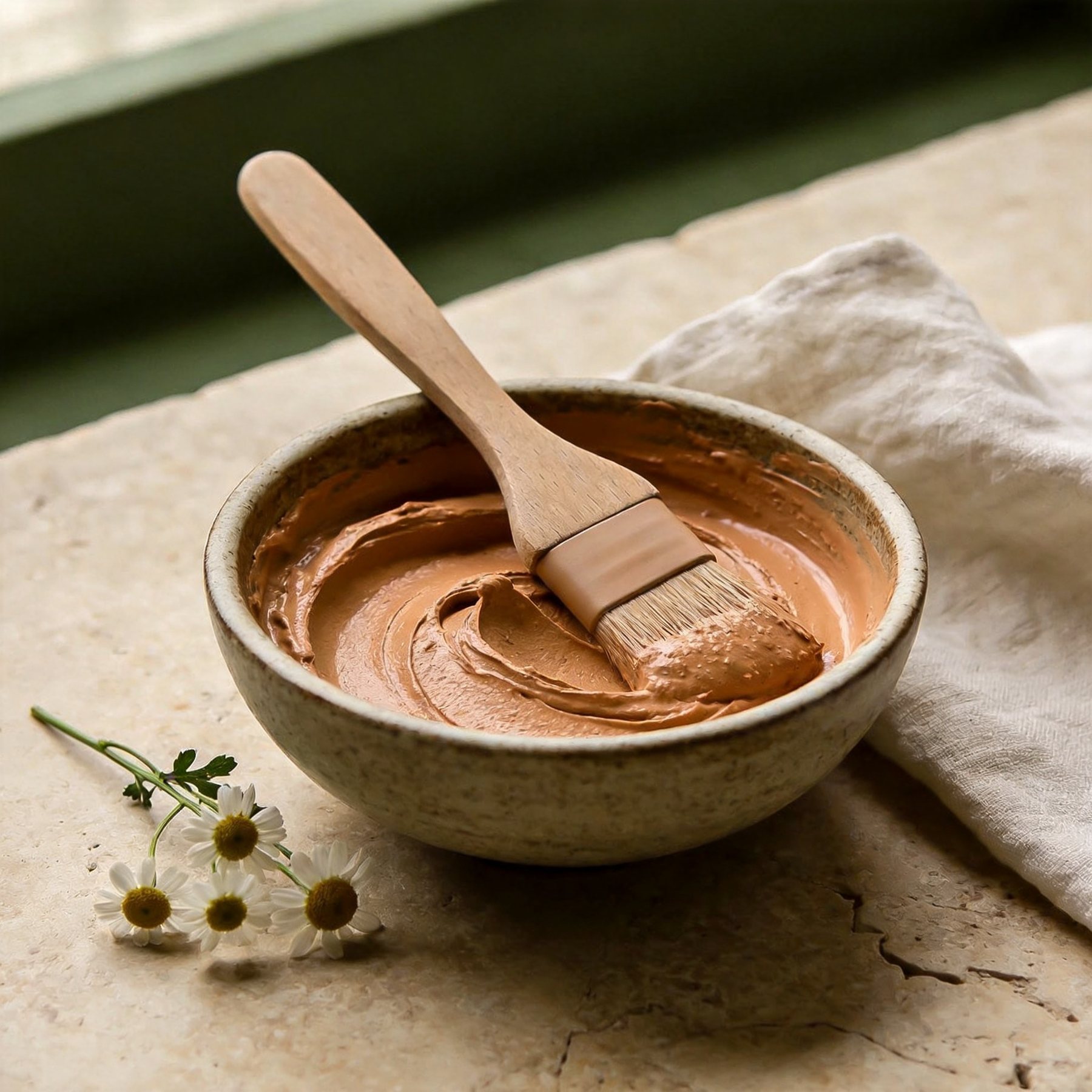
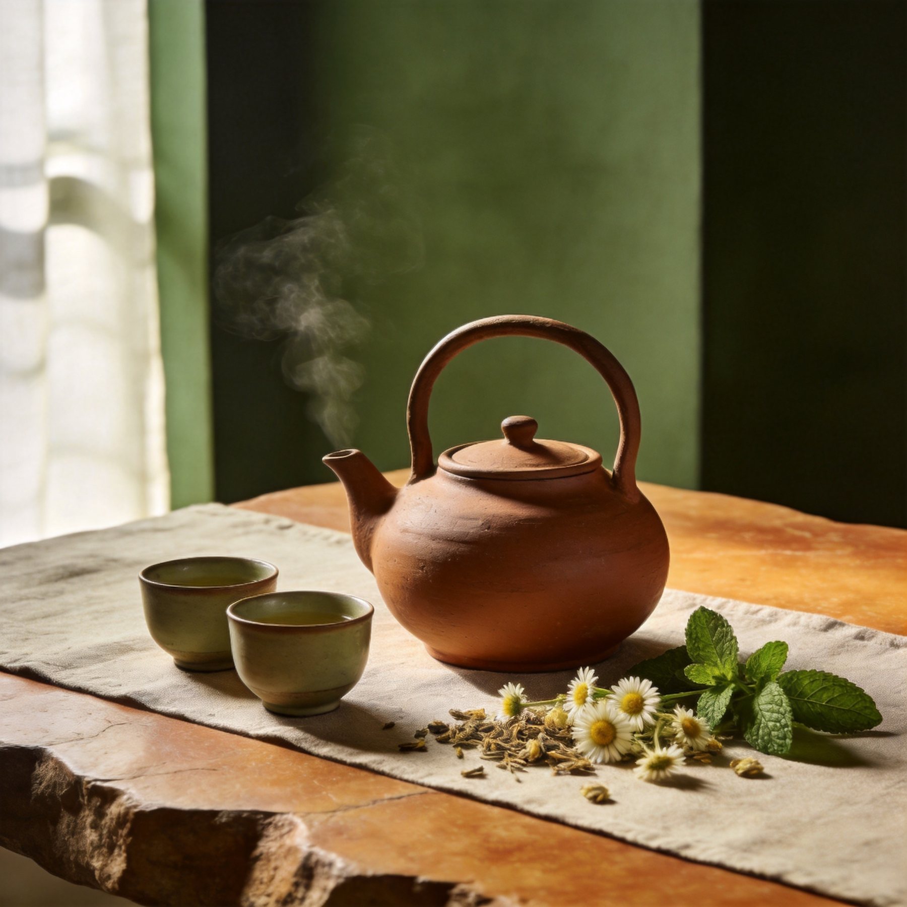
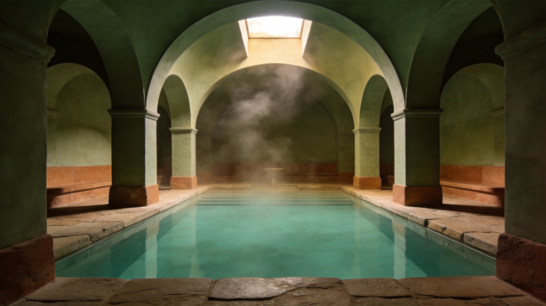
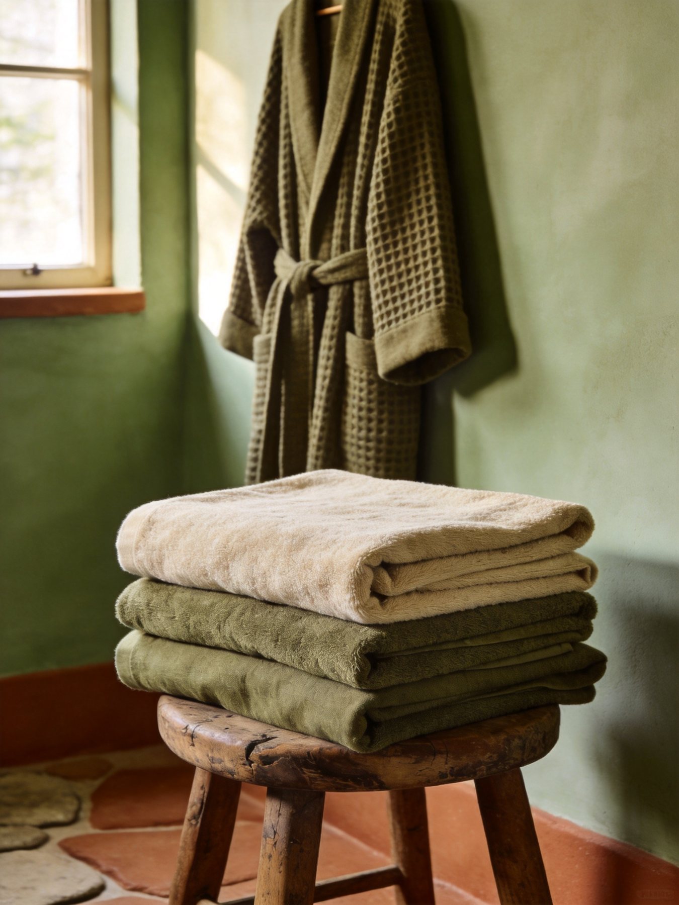
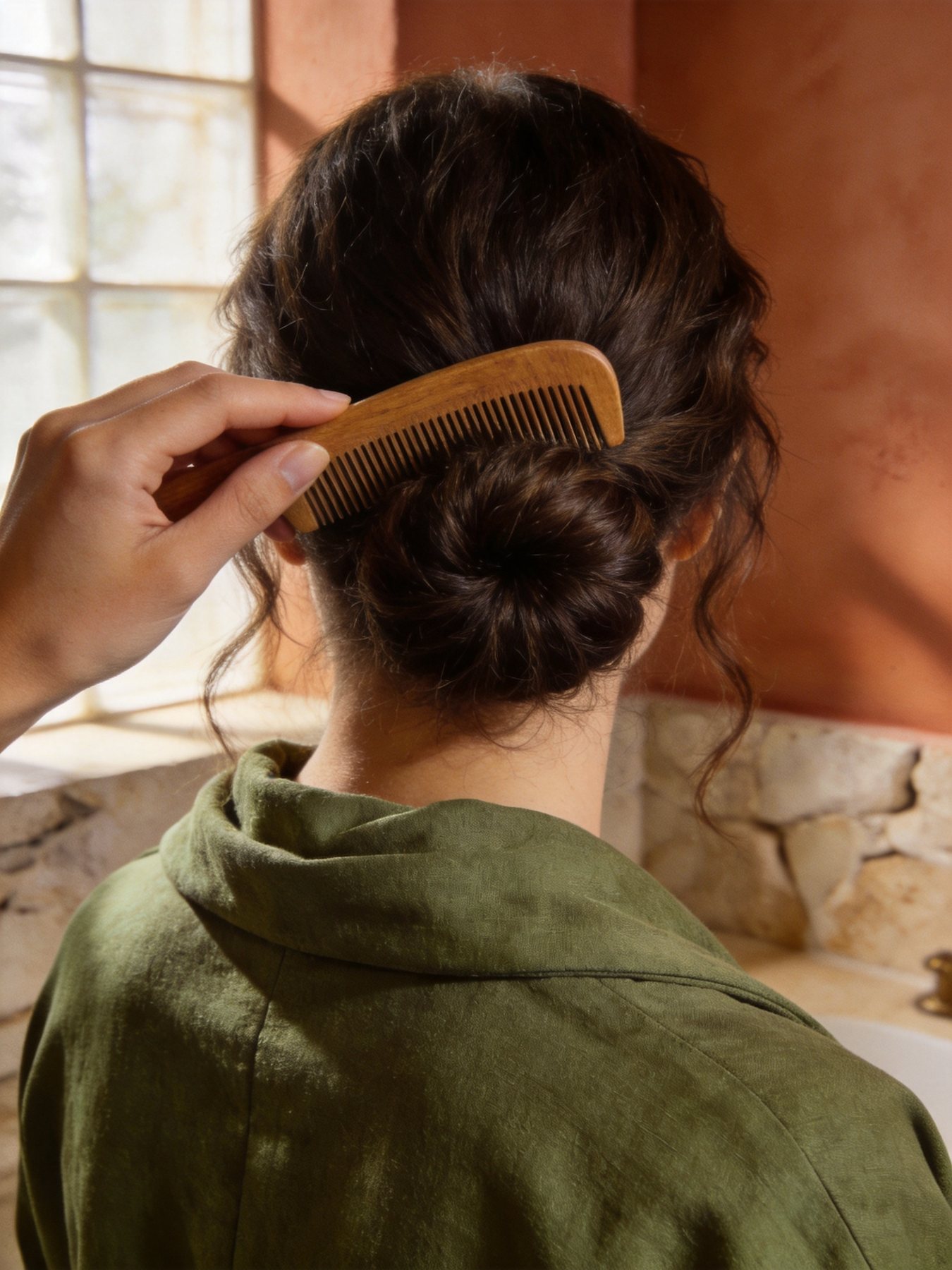
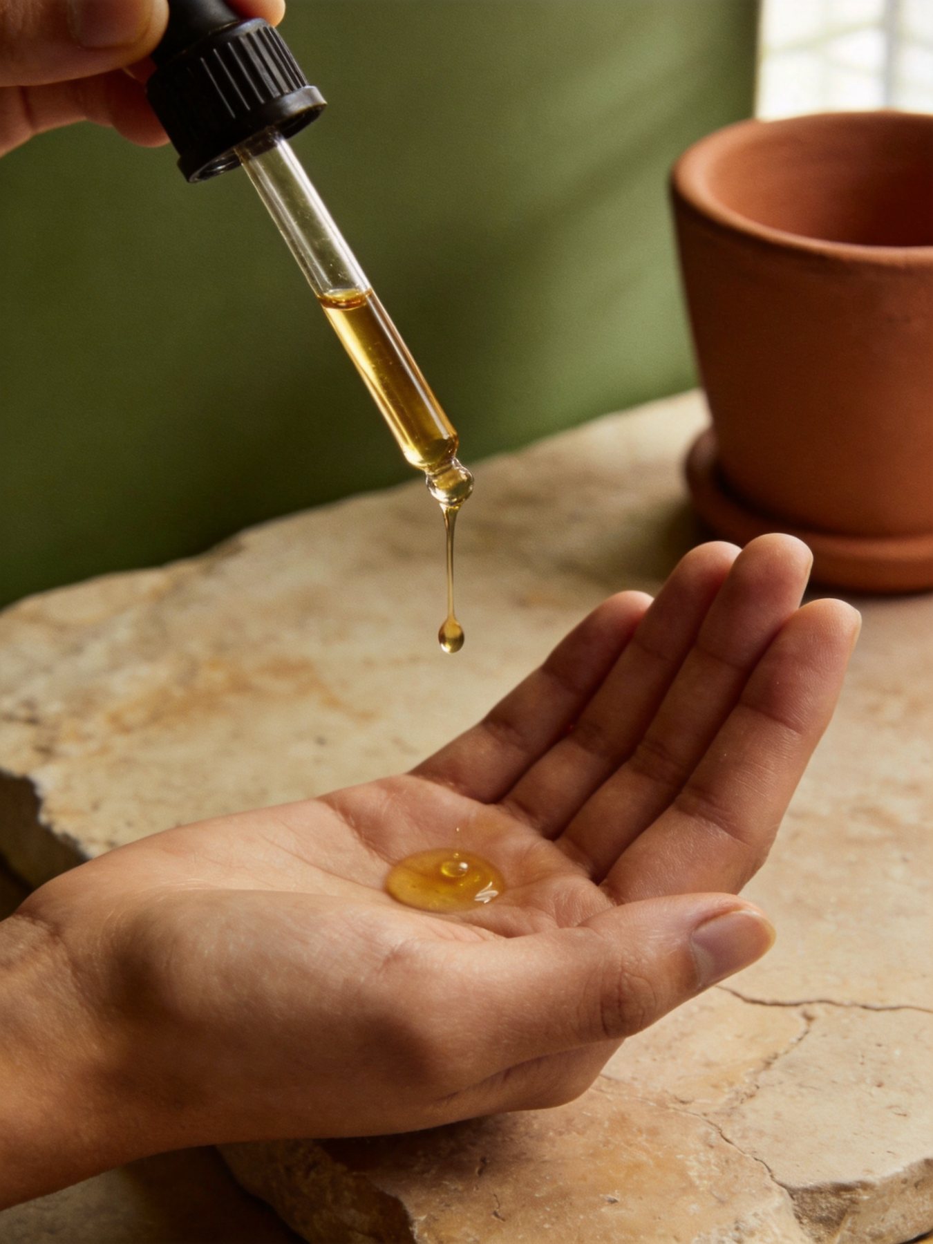
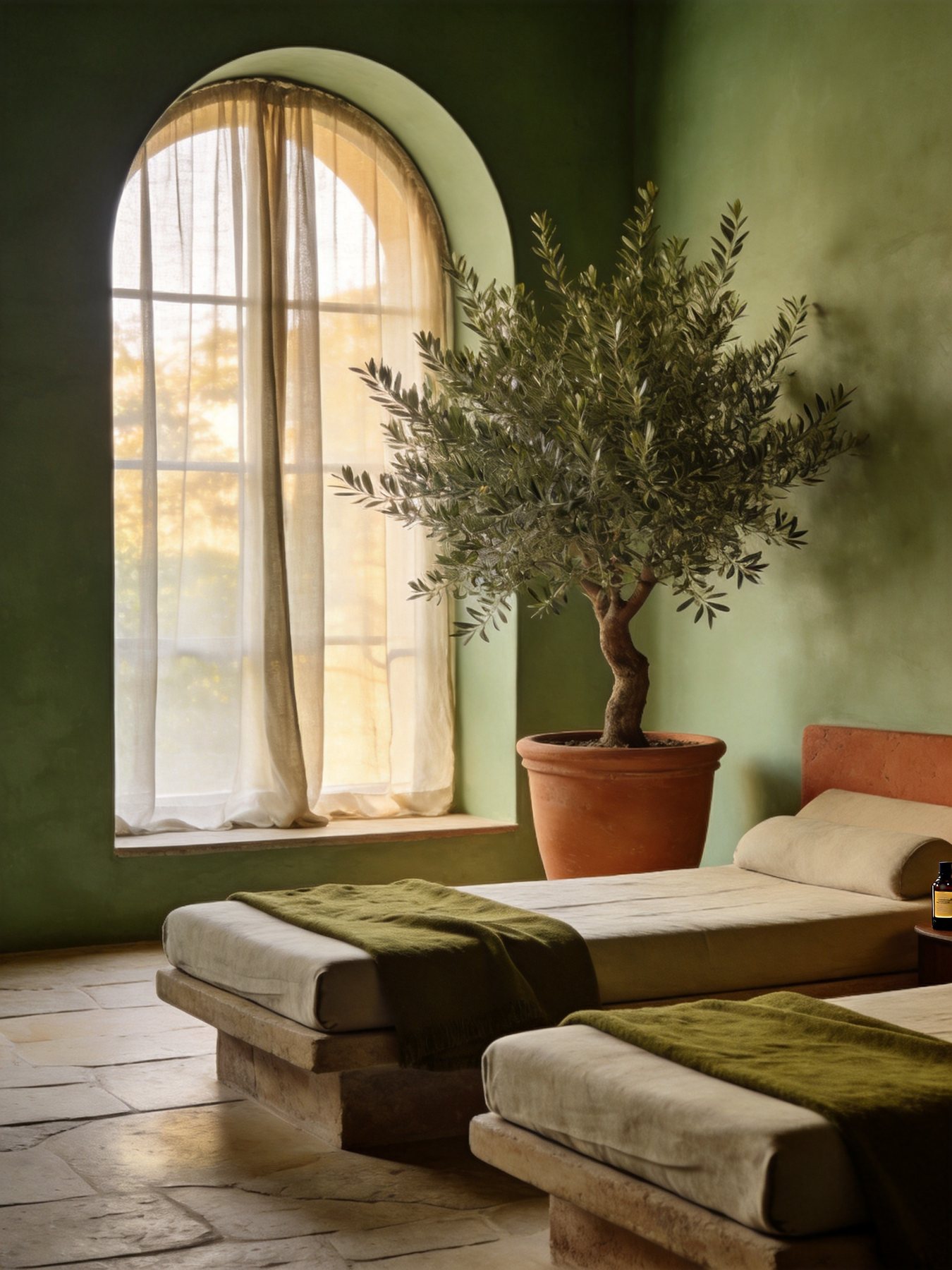
Medium-format still lifes in soft window light: limewash, travertine, linen, basalt, olive. No faces, no logos — ritual details and hands tell the story.